Version 6 updates
Launch my first mobile app on the Google Play store 3rd year student at Yoobee college with Bachelor's Degree in Software Development.
I have an interest in tackling a wide range of programming challenges. I enjoy working on some project with React, JavaScript, and Typescript, and I've also learned C++ for the backend projects. During my learning period, I took some of the Cloud courses like AWS Cloud fundamental and Microsoft Azure AI to get an idea for these two cloud platforms. During my semester break, I created my first mobile application by using the Flutter framework which makes me understand Dart language. The main reason the app is born was because I wanted to solve my problem and create an easy UX/UI "NOTEPAD" compare to other mobile app around the store.
My work mainly focus on Object-oriented programming (OOP) technique because I truly understand OOP programming code easy to maintain and organized. During my practice, I always maintain DRY (Don't repeat yourself) method in my work. I am also enjoy applied Agile methodology because I believe that divided project into smaller part able to get customer feedback immediately and make changes when needed.
Done two official certification, which is AWS Cloud fundamental and Microsoft Azure Ai fundamental
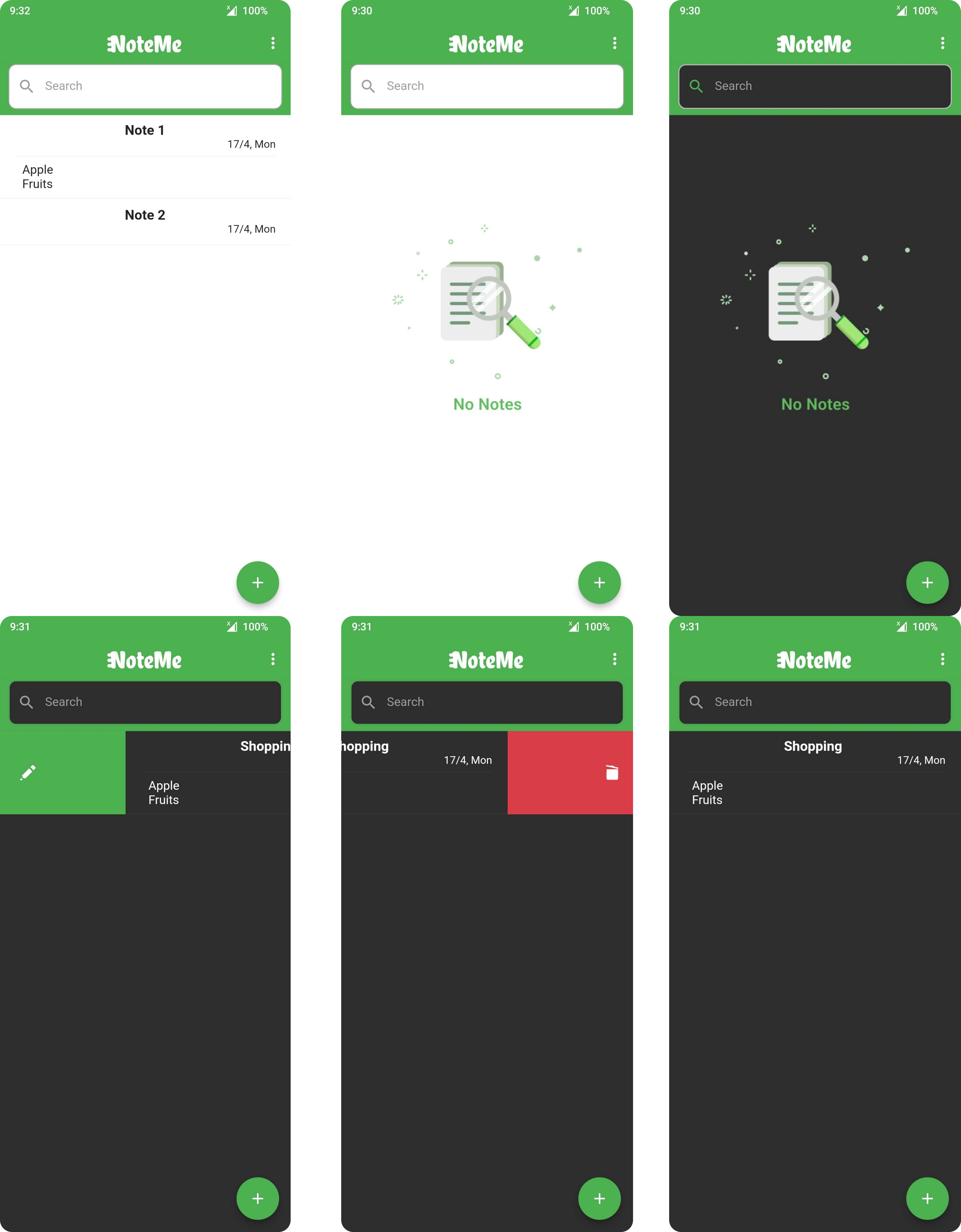
In the pervious update, I told you that I found an annoying line between the app bar and the search box. It's not easy to fix. But I still manage to get it done.
I am elevation the app bar to 0. But it's not fixed. After some googling, I found out that I need to change the scaffold background to the color that I use the same as the app bar.
The line is gone, but when the notes are empty, the whole section is green. Way way too unacceptable to me. Then I manage to create a container at the bottom. and change the color according to the theme.
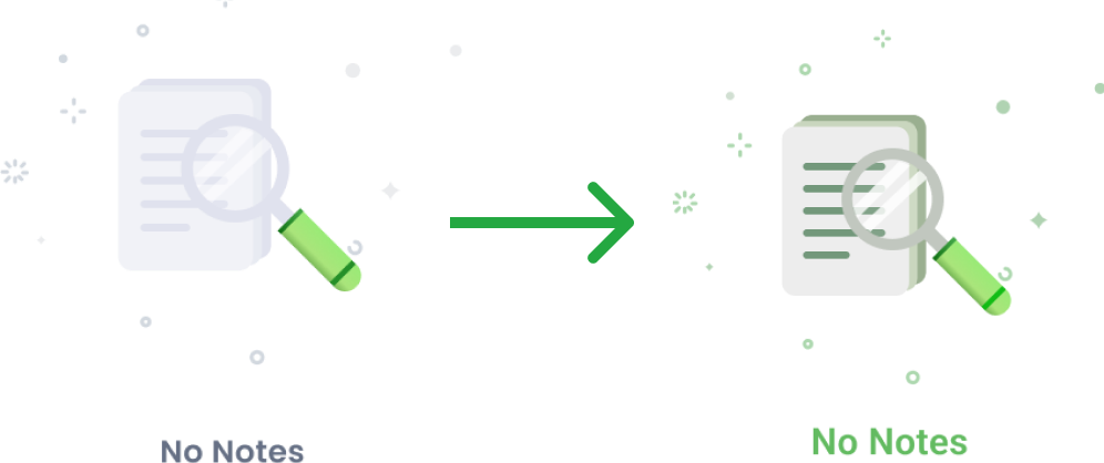
At the same time, I found out that when the status is empty. It's too empty and plain for this application. So I decided to include some images to have a better UI for the user. The cover you see is the first prototype from me and I found out it's not really nice on a dark theme, then I did some color adjustments that suit the light and dark theme.
In this version, I focus on the UI UX. The functionality looks great at the moment. Will do an update if I find any problem while I using it. That's all for this version updates, cheers!! (Day 17 on this application. )